Readers,
What did it take to go from this:

To this:

To this?
Got a minute? I’ll tell you.
I’m a fabric person, so I wasn’t thrilled to conclude that the best window treatment for our kitchen was a blind. Not floor-length draperies (obviously), or little cafe curtains, which would leave too much hard, dark, shiny window glass exposed before sunrise and after sunset when days are short.
No, for what we wanted–to be able to watch the passing neighborhood scene or shut it out, according to inclination–a blind was just the thing. Back in February I called the blind and curtain company Smith & Noble to send a designer over. She walked me through the whole process of choosing the widths and colors of slats and twill tape, did the measuring and the ordering, and in a couple of weeks our blind was installed. It looked and worked great.
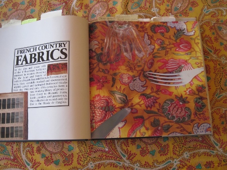
I lived with the blind very happily, but it wasn’t long before I returned to the matter of adding more colors, patterns, and shapes by way of fabric into the view of our kitchen window wall. I knew which fabric I wanted to use, too: a printed cotton from the legendary French fabric producer Souleiado. If you have ever seen Pierre Deux’s French Country: A Style and Source Book you may recall the gorgeous fabrics chapter showcasing Souleiado.

I had found this faded but still vibrant Provencal print at my favorite store in the world, Grandview Mercantile (right here in Columbus, Ohio), covering a little homemade comforter. I was immediately taken by the unusual combination of mustardy yellow, spicy brown, and vivid turquoise balanced by a terracotta pink. These weren’t conventionally pretty colors, but I found them arresting. I bought the little comforter for $35.
Months later, I took out my seam ripper and carefully undid the stitching of the comforter. That’s when I discovered this enchanting pattern was made by Souleiado. That was as exciting for me as it would be for someone else discovering that a lamp picked up at a garage sale was made by Tiffany.
I wanted to use this fabric where I could enjoy it every day, but I didn’t want to ruin it. That was a quandary so familiar to me as a clothing sewer: longing to use a fabric but fearing cutting into it before being certain the fit and the style of the garment were right.
How could I get to the point of being brave enough to cut into my precious, perhaps irreplaceable, fabric?
I thought, okay–I’ll just have to do a lot of mockups. Instead of thinking I would never know enough to be able to cut into my fabric, I thought about how many easy, cheap or free, reversible experiments I could run.
How about tracing the outlines of the kitchen window wall from a photo? After I did, I thought, “Everything but the faucet is a right angle! I want to mix in some curves!”


Paper is cheap. How about testing shapes and sizes of valances in paper?
Better yet, how about color-photocopying my fabric at our local library for 50 cents a sheet? Tape the pages together and hang them to get a sense of the impact of the colors and patterns mixed with the existing colors and patterns on the window wall?
I also thought to try finding more of this fabric and set up a daily search on the word “Souleiado” on eBay. After a couple of months, a three-yard piece turned up, in perfect condition–a very lucky find.
I set up a Pinterest board to collect valance and cornice pictures. (I mostly found designs I didn‘t want.)

I wanted a valance I knew could be machine-washed if it got dusty and dull-looking. That definitely meant I had to create my own construction plan to guarantee washability. But the instructions for the Zigzag Pelmet/Valance from the book Curtains and Blinds by Lucinda Ganderton and Ali Watkinson turned out to be very helpful.
I had two main questions to answer about the shape of this valance: the depth, and the bottom edge. I studied pictures to get a sense of what looked proportionate–not skimpy, and not like a hat that’s too big for its wearer. Then I tried paper mockups.

I realized after trying out some curves in paper mockups that determining the right size is not as easy as it seems. It was only after studying the print for awhile that I noticed the unbroken lengthwise curve that supplied the obvious shape of the border. I cut my photocopy along the curve–another cheap, easy, risk-free test–and had my answer.

The lining for the valance was another question. It had to be machine-washable and the right weight and drape. In my stash was a white cotton flannel sheet I had been saving for interlining coats that turned out to work very well.
All during this project I wished I could get a few minutes’ input from a designer for aesthetic guidance and from a window furnishings maker about construction techniques. That would have boosted my confidence and saved me time.

Instead, I dithered about the size and shape of the valance, questioned the completeness and accuracy of the instructions I was more or less following, and worried about drilling holes in the wall in addition to worrying about chopping into my fabric.
I had a lengthy conversation with the hardware store clerk about the right size of angle irons and wall anchors to buy as well as the dimensions of the furring strip for the valance mount.

In the absence of professional advice I did learn a lot along the way, and I applied knowledge from curtain- and garment-making to create a pretty nicely finished, proportionate–machine-washable, even!–valance from a beautiful fabric.
Monday afternoon I finished the stitching and pressing, and Jack installed the valance on its Velcro’ed mount.

What works, what doesn’t?
What works is, I’m satisfied with the construction. With my level of knowledge as a home sewer of mostly garments, I don’t think I could have done better.
What doesn’t work? The best way I can put it is, I think this burst of color, shape and pattern will work better when the eye can travel around the room and pick up on other bursts of colors, shapes, and patterns that will set up an intriguing rhythm.
Putting objects in a room is just the first step. Creating relationships among the objects is where a lot of the fun is going to be. I have more of this beautiful print and am thinking about how I can use it to delight the eye.


Beautiful colors!
I have been mad about these colors for years and years!
You are a genius making and using a photocopied mockup! I am keeping that idea, it’s brilliant. Beautiful project.
Thank you! I hope you use the idea and make it better!